Introduction:
Digital interfaces have always lived within rectangles.
Phones, desktops, tablets, and dashboards: every experience we design is constrained by edges, grids, and fixed viewpoints. As UX designers, we’ve learned to optimize within those limits: hierarchy, spacing, contrast, and flow. At Payoda, this same design rigor extends across platforms and emerging interfaces, helping businesses translate intent into intuitive digital experiences.
Spatial computing breaks that assumption.
With Apple Vision Pro touting floating “windows in space” and Valve’s Steam Frame pushing gaze-aware hybrid environments, the UI is no longer bound to a screen. Interfaces now exist around the user, responding not just to clicks or taps, but to where someone looks, how long they focus, and how they move through space.
This shift creates a serious design challenge:
- Traditional UI patterns don’t scale into 3D
- Flat navigation metaphors fail in volumetric environments
- Cognitive load increases when interfaces float without structure
- Designers need to think in terms of depth, distance, attention, and context
Spatial design is not only an aesthetic enhancement but also a very core transformation of how experiences are perceived and controlled. If thoughtful UX frameworks are not developed, then spatial interfaces risk remaining impressive demos rather than becoming usable products. This is where practical, human-centered thinking becomes critical. At Payoda, we see spatial UX not as a futuristic experiment but as an extension of design systems, behavioral insight, and real-world usability—principles that help emerging interfaces transition from novelty to everyday utility.
This blog breaks down how spatial design is changing, what this means for UX workflows, and how designers can approach spatial computing practically and human-centeredly.
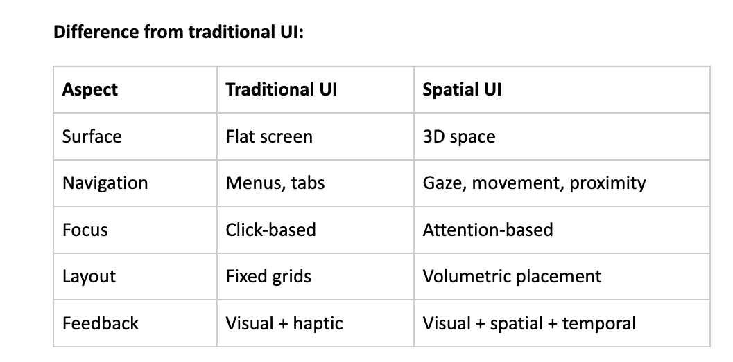
What is spatial design in UX?
Spatial design in UX focuses on how interfaces exist and behave in three-dimensional environments, as opposed to flat screens.
Key characteristics:
- Interfaces occupy physical-like space
- UI elements have depth, distance, and orientation
- User interaction includes gaze, head movement, gestures, and controllers
- Context changes dynamically according to where attention is cast.
Spatial UX forces designers to think less like screen designers and more like environment architects.
Apple Vision Pro: Windows Leave the Screen
Apple Vision Pro introduced a mainstream mental model for spatial UI: floating windows anchored in real space.
Design Implications:
- Apps no longer default to full-screen
- Windows can be naturally resized, repositioned, and layered
- UI competes with the real-world environment
- Depth becomes part of hierarchy
UX Lessons From Vision Pro:
- Users expect spatial consistency – A window which is placed on the left should stay there
- Depth serves as a priority – Closer elements feel more important
- Overcrowding space causes fatigue faster than cluttered screens
- Micro-movements replace explicit navigation: head and eyes
Pain point for designers:
- Existing UI kits don’t translate directly.
- Flat layouts feel awkward when “floating.”
- Too many windows create attention fragmentation.
Spatial design demands restraint and intent.
Valve Steam Frame: Hybrid Spatial Computing
Valve’s Steam Frame does things a little differently.
Rather than replace 2D interfaces, it will merge VR environments with traditional desktop apps, leveraging gaze-aware streaming.
What makes it important:
- Users still depend on 2D software.
- Productivity apps coexist with immersive environments.
- Interfaces change according to gaze and attention duration
Key UX shift:
- Interfaces react to where users look.
- Prioritization of content changes in real-time
- Passive elements that fade when not in focus
- Where attention lingers, active elements surface.
Design Challenge:
- Designers need to predict attention, not only actions
- UI states are not static anymore.
- Layout becomes conditional rather than fixed.
It is a hybrid model that more accurately reflects real-world enterprise, gaming, and productivity use cases.
Why Traditional Patterns of UX Fail in Spatial Design
Common failures while porting 2D UI into spatial environments:
- Floating dashboards without any depth logic
- Menus requiring too much head movement
- Overuse of panels creates spatial clutter.
- Without any visual anchor points for orientation
Cognitive problems of users:
- Disorientation
- Eye fatigue
- Decision paralysis
- Reduced job completion
Root cause:
- Designing screens, not designing space
- Treating spatial UIs as “3D screens”
- Ignoring human perception and attention span.
Spatial UX needs to minimize effort, not maximize novelty.
Core principles for Effective Spatial UX Design
1. Attention-Centered Design
Design for attention, not interaction.
- Gaze is the new hover
- Focus duration indicates intent.
- Interfaces should respond, not attack
Examples:
- Highlight content only after a sustained gaze
- Delay animations to avoid distraction
- Use soft focus changes rather than pop-ups.
2. Spatial Hierarchy
Hierarchy now includes distance and depth now.
- Foreground = primary actions
- Mid-ground = supporting information
- Background = context or passive data
Design rule:
If everything is equally close, then nothing seems important.
3. Anchoring and Orientation
Users need spatial landmarks.
- Anchor key UI elements to stable reference points
- Maintain relative positioning
- Avoid unnecessary floating movements.
Anchors reduce the cognitive load dramatically.
4. Minimalism Becomes Mandatory
Excess in spatial design is exhausting.
- Fewer elements, more meaning
- Clear intent for each UI object
- White space has become physical space
This is where strong UX discipline matters the most.
A Practical Spatial UX Workflow
Step-by-Step Designer Workflow
Step 1: Defining Spatial Context
- Is the user seated or mobile?
- Is the environment real world or virtual?
- How long does the session last?
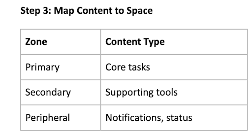
Step 2: Attention Zones Identification
- Primary gaze zone (straight ahead)
- Secondary zones (left/right)
- Peripheral awareness areas
Step 4: Design Gaze Behaviors
- Hover Delays
- Focus thresholds
- Dismissal timing
Step 5: Prototype in Motion
- Static mockups are insufficient
- Motion reveals friction
- Test eye strain and neck movement
Real-world Use Cases
Enterprise Dashboards
Problems:
- Data overload
- Competing priorities
- Frequent context switching
Spatial solution:
- KPI panels in primary view
- Secondary metrics off to the side
- Alerts appear only when relevant
Result:
- Faster comprehension
- Reduced Fatigue
- Better Decision Confidence
Design Reviews & Collaboration
- Multiple artifacts visible simultaneously
- Natural comparison without tab switching
- Shared spatial reference improves discussion clarity
Gaming & Hybrid Productivity
- Gameplay + chat + tools in one space
- Seamless transitions between immersive and functional
- Personalized spatial layouts
How Payoda Approaches Spatial UX
At Payoda, spatial design is treated as a UX systems problem, not a visual experiment.
Our approach focuses on:
- Human Attention Modeling
- Cognitive load reduction
- Hybrid UX systems that scale across devices
- Beyond Flat Screen Prototyping
Rather than forcing novelty, the goal is to make spatial interfaces feel intuitive, predictable, and efficient, especially for enterprise and emerging tech platforms.
Payoda can solve it by converting spatial complexity into usable, human-centered experiences.
Takeaway points for UX designers:
- Spatial UX is not 3D UI—it’s attention design
- Depth and distance become the hierarchy tools, instead of size and color.
- Gaze-aware systems require behavioral thinking.
- Minimalism is necessary, not optional.
- Designers have to think like environment planners.
Conclusion
Spatial design marks one of the biggest changes to hit UX since mobile-first.
As interfaces continue to push beyond screens, designers can no longer depend solely on grids, breakpoints, or familiar navigation patterns. We are now designing how people perceive, focus on, and move through information in space.
So technologies like Apple Vision Pro and Valve’s Steam Frame are early signals and not the final answer. They show what’s possible but also expose how unprepared traditional UX workflows are for spatial environments.
The opportunity is in restraint and intention.
The best spatial experiences will not be the loudest or most visually complex; rather, they will respect human attention and reduce cognitive strain by quietly adapting to the user’s focus.
The spatial UX will reward designers who understand behavior over aesthetics, systems over screens, and experience over novelty.
Those who adapt early will define what the next generation of digital interfaces truly feels like. At Payoda, we help teams translate emerging interface shifts into practical, human-centered design systems, so organizations can move confidently from experimentation to real-world impact.
FAQ'S
- 1. How does spatial UX differ from traditional VR UI design?
Spatial UX is targeted at usability, attention, and productivity rather than purely at immersion.
- 2. Can current 2D UX designers make a transition into spatial design?
Yes, that would be the core shift: thinking in space rather than screens.
Talk to our solutions expert today.
Our digital world changes every day, every minute, and every second - stay updated.